
Eagle Crest
Brand Identity + Print Design + Signage
The team behind the Eagle Crest Industrial Park needed a brand for its state-of-the art, Class-A industrial development. The park covered 353,750 square feet and was in need of a brand that would highlight its cutting edge presence in the Raleigh area.

OCD Campaign
Brand Identity + Logo Design + Illustration
A campaign bringing clarity to the public about Obsessive Compulsive Disorder through typographic form.


Type Concept
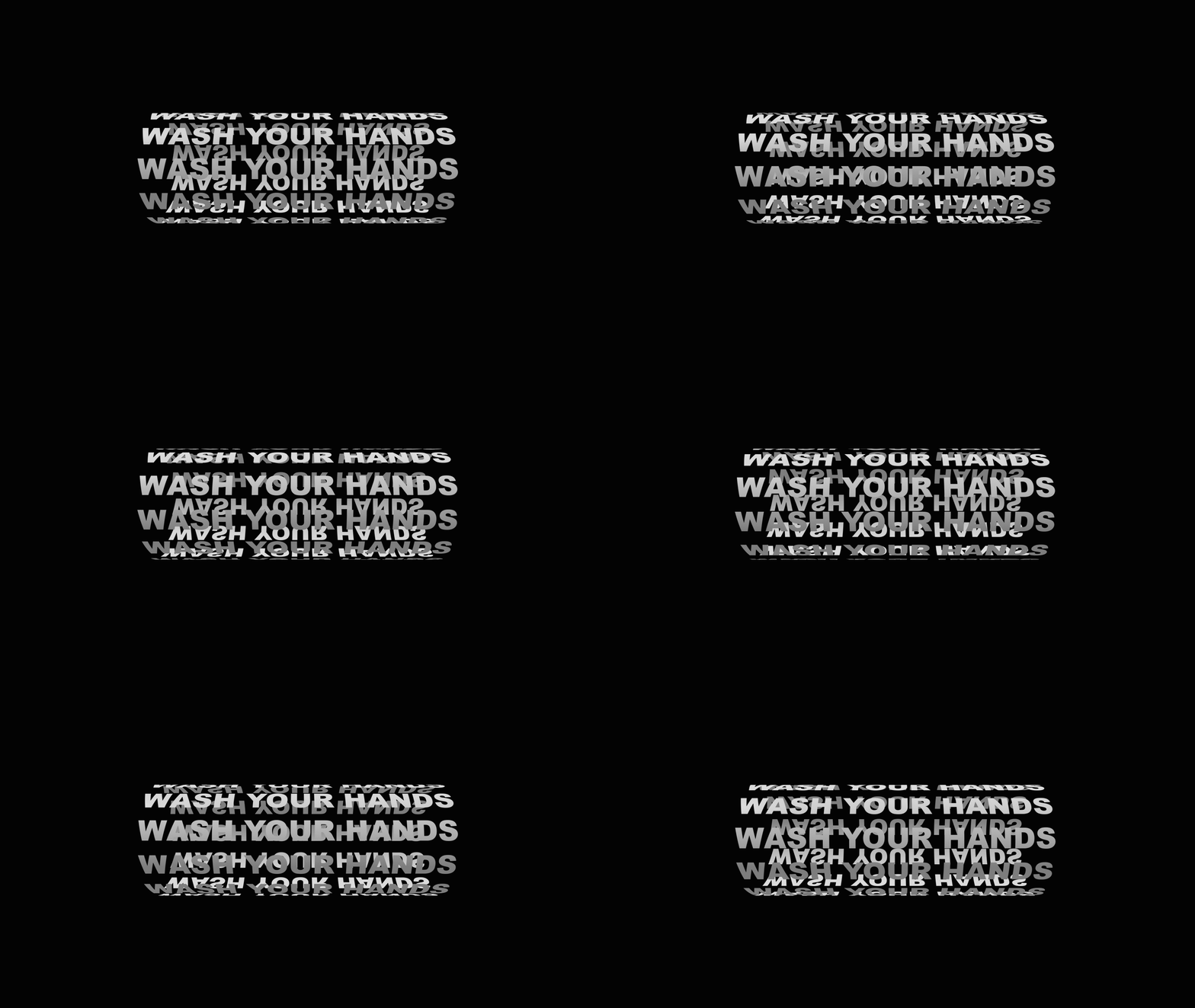
The concept of the campaign was to visually display the inner challenges of someone with OCD solely through typography, form, and color. Specifically, due to the disorder’s dependency on obsessive thoughts, the entire campaign relied heavily upon repeated type.
The repeating OCD thoughts were juxtaposed against simple concrete statements stating "It's not about the obsession". This was to bring attention to the fact that the disorder is not about the obsession, but instead is much more about the never ending cycle of thoughts.
Color + Form
Care was taken to make sure that the type not only repeated, but also formed never-ending loops.


The End Result
The OCD campaign came together with many different materials, including matching t-shirts that formed a full loop when placed next to each other. All of these items individually represented aspects of life with OCD while also sending an even larger message about the incorrect stereotyping of mental disorders displayed in the media.

